Copilot Notifications Case Study
Copilot is an Xaxis-built AI technology that optimizes digital media investments towards real business outcomes. The web platform users lacking a positive user experience with the notifications.
I conducted evaluative user research to improve the Copilot notifications user experence.
Project Summary
- My Role: UX Researcher, Product Designer and Recruiter
- Research Type: Remote Evaluative Research
- Company: Xaxis
- Company Type: B2B Corporate
- Industry: Media Company, Artificial Intelligence
- Team: Product Manager and 2 UX/UI Designers
- Tools: FigJam, Notion, Airtable, Microsoft Teams, Google Slides and Docs
💣 Problem
User Problem:
The Product Manager shared the support team received several user complaints and confusion about the Copilot notifications. My role was to research how to improve the notifications experience for users, and by doing so will alleviate the one-person support team also.
Note: The specific user problems were not known during the early discovery stage of the project. I later found out what the user problems were for the original version of notifications during the discovery research before the redesign.
Project Challenges
- Time and budget limit constraints.
- International timezone differences caused scheduling conflicts and delays when recruiting research participants.
- For the first round of user research, I did not have a login to the Copilot platform so I had to rely on screeshots and video captures from colleagues that had a login.
Research Approach
My Process
Research Methodology
Why Methods Were Selected
- User Interviews were conducted to gain insights into users' wants, needs, and pain points related to notifications.
- Preference Testing was conducted to evaluate different design variations, uncovering user preferences and the reasons behind them. This insight helped narrow down the best UX and UI options.
- 🧪 🧫 Usability testing was conducted to assess discoverability and task completion, determining whether users could independently find key features and information, and if the design was intuitive.
UX Deliverables
💡 UX Discovery with Team
User Route Options for Team Brainstorming
![]() User Flow in FigJam
based on product manager discussions with the
engineering team on technical constraints.
User Flow in FigJam
based on product manager discussions with the
engineering team on technical constraints.
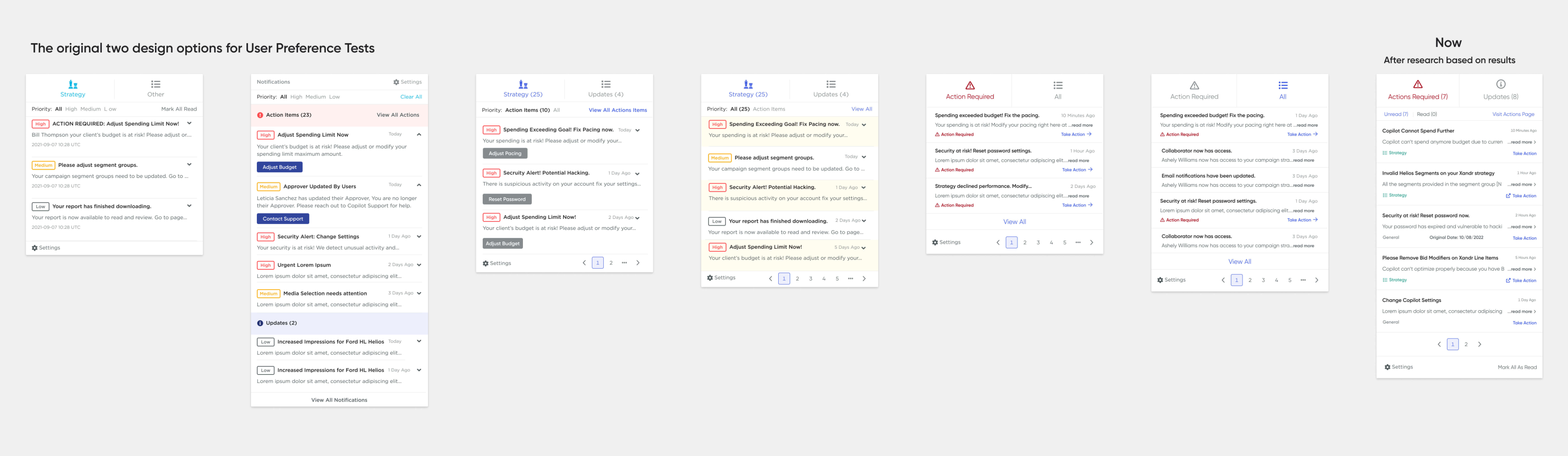
Several 🎨 design iterations in Figma.
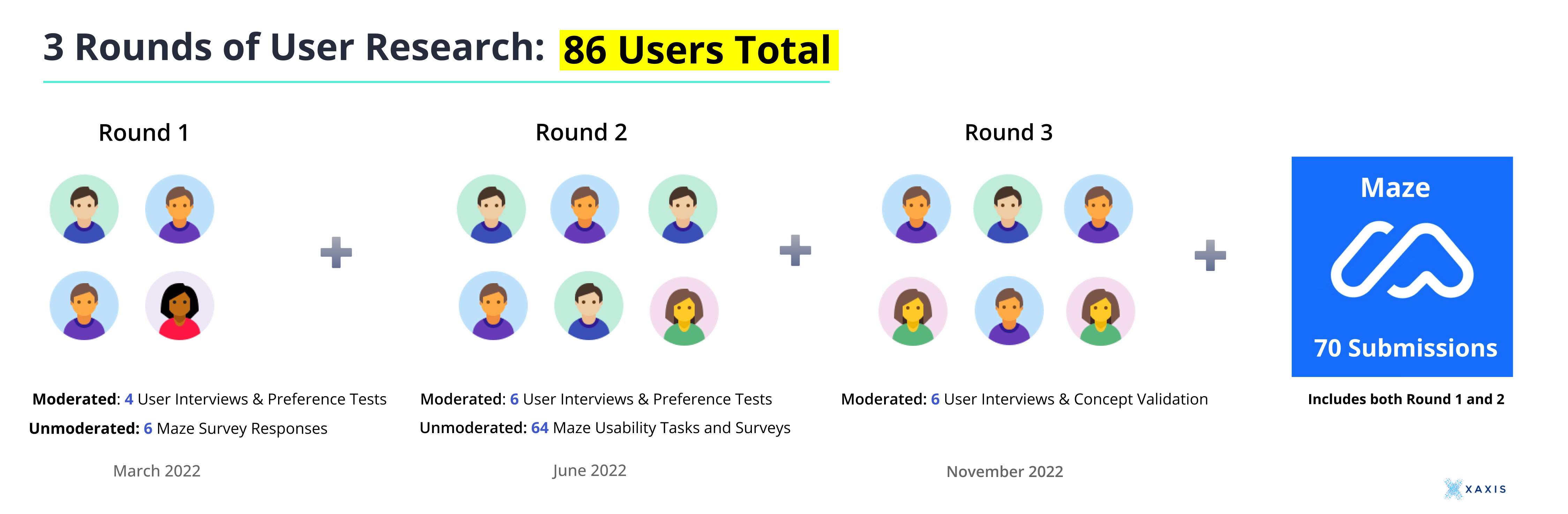
3 Rounds of Research Reports
📊 📈 Maze Report
🎤 📹 Conducting Research
🔑 And Key Insights and Findings
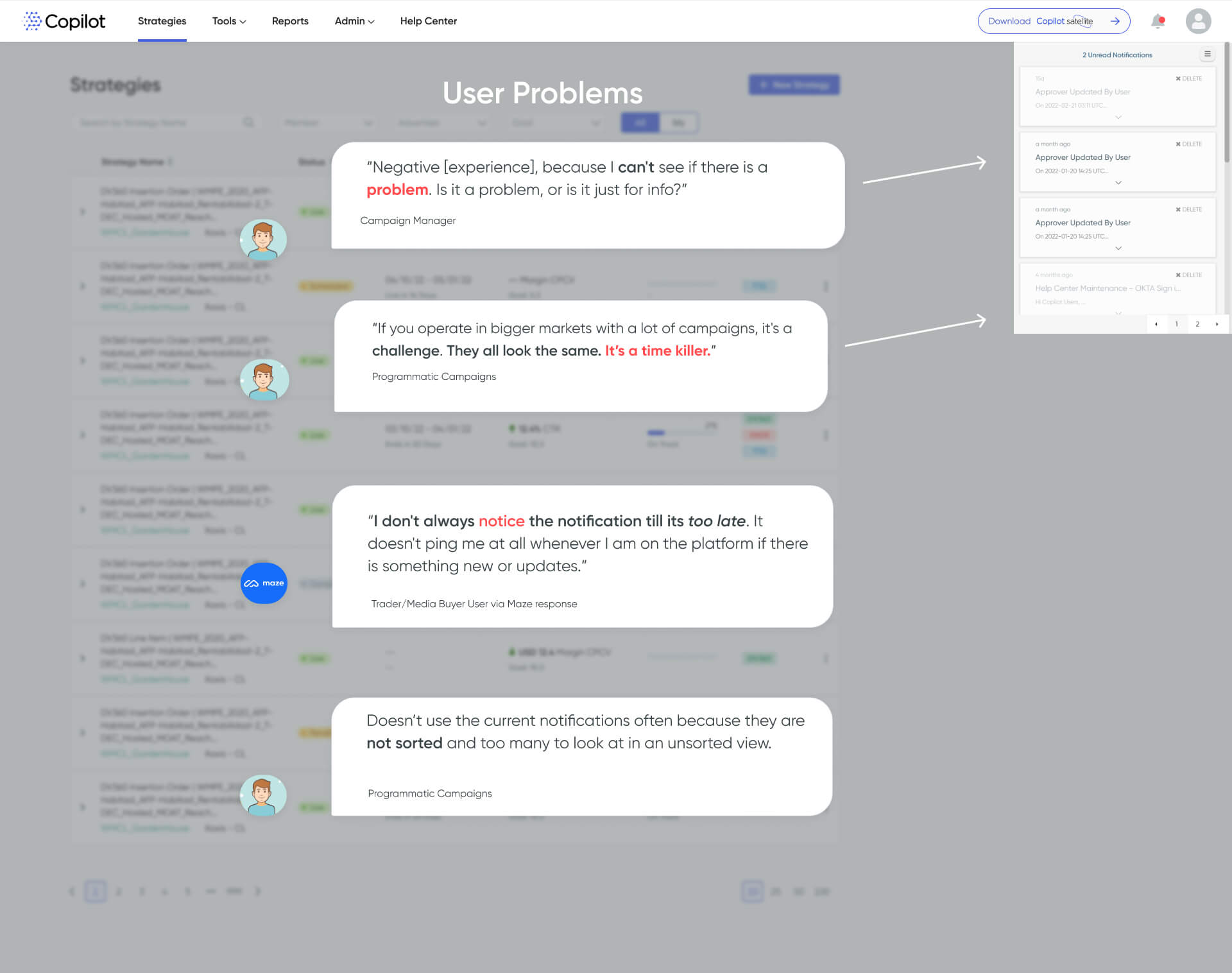
The first Discovery research stage revealed the different problems that users were experiencing with the old notifications. User Quotes in the image below are from User interviews and open-ended qualitative survey questions.
Secondary Research
In addition to the primary research that I directly conducted, I also used secondary research sources to find out the best practices and UX patterns for notifications to help determine the new design.
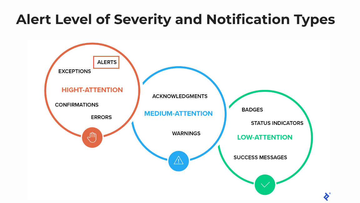
Action-required notifications alert the user of an event that requires a user action. Action-required notifications are often urgent and should be intrusive. Source: Nielsen Norman Group Article - Indicators, Validations, and Notifications: Pick the Correct Communication Option
💡 UX Problem Solving Strategy
User Quote
I don't always notice the notification till its too late. It doesn't ping me at all whenever I am on the platform if there is something new or updates.
- Trader User via Maze survey response
Solution Ideation based on UXR Insight
🤔 How Might We get users' attention to make them want to check their notifications?
💡 A toast notification pop-up alert!
💡 Notifications that require users to take action!
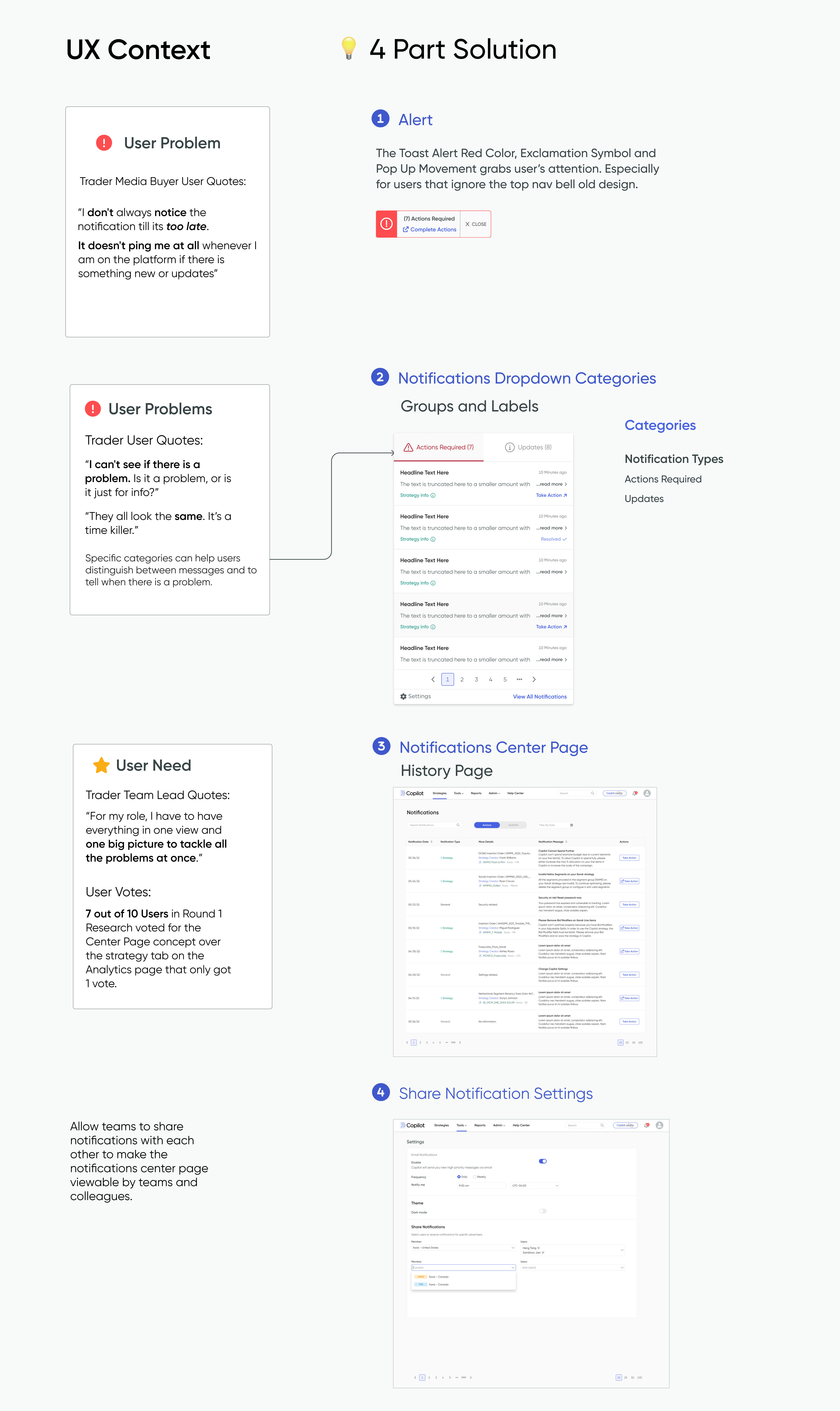
I used both primary and secondary research to back up my solution ideas to redesign the notifications.
🧪 🧫 Testing Solution Idea
Usability Scenario Task Sample
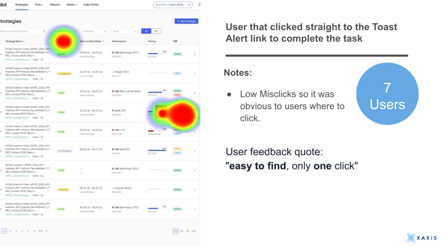
My next step was to test my solution ideas with real Copilot platform users. In user testing, it is possible to accomplish two goals in one task. The task I created combines two usability goals: Discoverability and Usability.
I decided to use Maze to test the discoverability of the toast alert pop-up idea to see whether it would get user's attention as intended.
User Scenario and Task
You have received a notification that your strategy spending has exceeded the budget limit. Navigate to find the relevant notification to take action.
What we will find out for Discoverability:
- Will users realize the toast alert can take them to the action?
- Will users notice (or discover) the toast alert at all?
- Will users discover the notifications center page?
- Will users be able to complete the task and navigate back to the notifications center?
What we will find out for Usability:
- How easy or difficult is it for users to navigate where they need to go to complete the task?
- Which UI path option is the most intuitive for users to complete the task? In other words, will users choose the top nav notification bell or the toast alert link?
Usability Results
Results and Impact
Finalizing the Project
🎨 Design Iterations
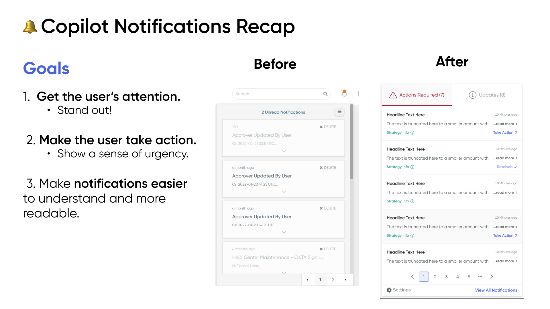
Impact
- As of November 2023, the notification read rates ⬆️ increased from 6% in 2022 to 16% in 2023. Some quick progress a few months after it was launched!
- Most users navigated to the Notifications History page through the pop-up toast alert "Complete Actions" link. This is understandable because it is more convenient and easier than drilling into the nav bell dropdown.